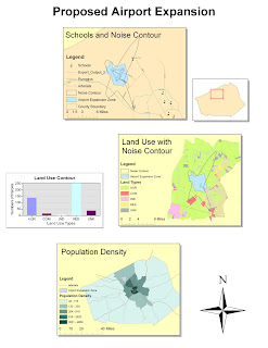
Note: The computer I used in SSCL wouldnt allow me to pull or manipulate data from my USB (I had this problem in class). This created a problem for the third exercise. I did all the steps correctly however it refused perform the calculations for POP_Den. It just gave me for all the values. That is why my bottom graph doesnt show any green area, and I couldnt include a legend as a result.
Potential and Pitfalls of ArcGIS
How broad the ArcGIS proved to be during my experience with it thus far has truly amazed me. The program’s ability to run calculations, generate graphs, incorporate aesthetic features, and perform spatial analysis all goes to show that it is very expansive. The program seemed like it took Microsoft Excel, Adobe Illustrator, Microsoft Word and mashed them up into a single map-oriented program. I thought each of the exercises would delve into finer details; however, this was not possible because ArcGIS has so many different applications to offer. Each of the 4 exercises served to merely scratch the surface of a different function that ArcGIS can perform.
However, the breadth of this program has its consequences. For a beginner like myself, the range of applications in this program creates a steep learning curve. The program still felt unfamiliar after going through the exercises multiple times. Furthermore, even though the tutorial easy to follow, it seemed like, as I said before, it only scratched the surface. The more advanced settings and features that the tutorial shied away from were very daunting to just look at. The program is not necessarily user-friendly in the way GoogleMaps is; however this pitfall is easily cured by experience and practice.
The dynamic performance of ArcGIS is another extremely helpful attribute of this program. ArcGIS is not a map. It has the ability to perform spatial analysis, recalculate and focus in on any details the mapmaker wishes. After finishing my map, I realized that I could boot the program back up, make a few slight adjustments, and present a map that had a completely different intended purpose. The way in which ArcGIS enables you to zoom in and out and recalculate information on different dataframes (the county boundary minimap) was tremendously useful.
I noted another setback during the fourth exercise. Even though the program offered tools to improve the look and feel of the map with colors and drop shadows, it still lacked some graphical splendor. This is of course irrelevant in an academic context because scholars are primarily concerned with the spatial analysis or accuracy of one’s work. However, eye-catching graphical displays are good in that they grab the attention of on-lookers. An informative map is not of much use if people don’t look at it. I have only worked with the program for a few hours so I am not certain that it lacks this feature, but it is one that I noticed.
A major setback of GIS is that it relies on inputs of data, which is either primary or secondary. It is advised to use more secondary data because it will save you time, effort and materials. However, this presents some problems. It could be the case that no secondary data exists on the topic of your research which forces you to directly capture your own data. Also, any secondary data that you do use could be inaccurate or outdated. In this sense, GIS can be either very dependent or time consuming and that is one of its pitfalls.
The potential of GIS has to do with its analysis. Humans often lack the capability to point out patterns when faced with an array of data. It usually require pleasant visual displays to point these patterns out. Sure it is possible to comprehend a number (ie the number of gallons of oil spilled in the ocean) but GIS allows viewers to better grasp the effects of the data your are dealing with.

Nice. Hopefully you'll be able to deal with the saving files problem in future assignments.
ReplyDelete8.8/10