Thursday, May 27, 2010

Week 8 Lab


Both maps illustrate the spread of the Los Angeles Station fire over a time span from August 29-September 2, 2009. This fire was the most devastating fire of the California fires in 2009, burning over 160,000 acres and killing two fire fighters (LA Times). It is also important to note that the fire destroyed 89 residence, 94 out buildings and 26 commercial properties (KTLA news). I must emphasize this information because it comes into conflict with the spatial analysis I conducted. However I will give possible reasons for such discrepancies because they are too large to ignore. The fire engulfed the northern part of Los Angeles County, just North of Pasadena, and burned a considerable portion of the Los Angeles National Forest.

There was some controversy surrounding the fashion in which the Los Angeles Fire Department dealt with the Station Fire. Some postulated that there was a lack of resources due to budget shortfalls. However, the Forest Fire Chief at the time ensured that any lack of deployment of resources was based on their belief that the fire could be easily contained (KTLA news). Initially, only three helicopters and limited ground forces were deployed to combat the fire. Soon, it was realized that this was not enough. As the maps show, the fire grew tremendously in the 2nd day. This expansion was fueled by the Santa Ana winds, which are notoriously strong in this area. The end all cost of this fire worked up to a hefty sum of $83 million (KTLA news).

The reference map incorporates a variety of data. As a base, it shows the county area in yellow. From here there is major highway, river, water body, city and park data overlain to better orient the viewer. There wasn’t any elevation data added to this map, however, a viewer can indirectly determine the mountainous regions based on the river data.

The thematic map measures the households that were affected, over time, by the Station fire. The spatial analysis I conducted highlighted the population data that was within the area the fire covered. I chose to focus the analysis on the number of households that were affected by this fire. If you refer to the excel graph included in this report, the number of houses affected reaches upwards of 800 (UCLA Gis Pop Block Data). In this map, each data point does not represent an individual household. Instead, it is a value that represents the number of households in close proximity. I am unaware of how strongly these values are tied to their geographic location, but this presents some problems that I will discuss.

As I referred to before, the number of households affected by the fire as determined by my analysis was drastically different from the actual reporting. 800 is nowhere near 209, which is the official record. This error could be a result of the time the data was measured, which was in the year 2000. However, this is unlikely because the population or the number of households is likely to have gone up since then. The more likely reason for this discrepancy is the spatial inaccuracy of the data. It is probably the case that the points from the population data don’t precisely correlate with its geographic location. Furthermore, some of the houses highlighted by my analysis could have been within the area of the fire but remained unaffected.

Bibliography

“On the Fire Lines.” LA Times. URL: http://www.latimes.com/news/local/la-me-bigpicturefire,0,5985825.htmlstory

“Report: Number of Firefighters reduced before Station Fire” KTLA News. October 9, 2009 URL: http://www.ktla.com/news/landing/ktla-angeles-fire,0,5292469.story?page=2

UCLA Gis URL: http://gis.ats.ucla.edu//Mapshare/Default.cfm#

“2009 California Wildfires.” Wikipedia. URL: http://en.wikipedia.org/wiki/2009_California_wildfires



Wednesday, May 19, 2010

Week 7 lab


The geographic location of the area covered by these DEMs is Lake Tahoe and its surrounding mountains. The data collected from the USGS website had some errors. If you take a look at the lake in the Color Ramped Shaded Relief and Aspect maps, it shows varying “strips” of data across the lake. This is most likely caused by measurements taken at different times or perturbations in the water. Also to note, the DEM maps include parts of both California (Western side) and Nevada (Eastern side). Furthermore, there is a buffer area around the lake that captures most of the high elevation areas. The range of elevation spans from roughly 1400m to 3300m. The extent of this map from West to East is –120.304 to 119.720, and from North to South it is 39.345 to 38.880. Lastly the geographic coordinate system used for these DEMs was the GCS North American 1983.

Thursday, May 13, 2010

Week 6 Lab


The average map on-looker has no idea that maps come in various projections, each of which offers its own advantage. Most would never question how a flat map could represent curvaceous objects like our planet Earth. In this sense, maps are very versatile and can serve many different purposes. This project reveals the different advantages, and disadvantages thereof, that a map can offer. This becomes much more apparent when comparing the distance between DC and Kabul that each map projects. This exercise required us to include two maps that are conformal, two that are equidistant and two that are of equal area. Each serves its own purpose.

Conformal maps, by definition, preserve the angles between the curves that the map is oriented about. This is said to produce more accurate shapes and angles on the local scale. However, it does not necessarily maintain equal area nor equal distance. Of the 6 map projections, the Mercator and Gall Stereographic are the two exclusively conformal maps. Despite the accurate representation of angles, these conformal maps distort both distance and area. However, a map like the Robinson projection map is neither equal area nor conformal, which is said to bring about a better view of the entire world. In conclusion, there is no perfect projection.

The advantage of Equidistant maps is fairly obvious; the distances from the center of the projection to any other place on the map are uniform in all directions. This is important when the spatial analysis of a map requires accurate distance readings. An example of this would be the range of missile attack that a country is capable of. Wouldn’t you want to know if your country was within range? The Equidistant Cylindrical and Equidistant Conic projections are the two equidistant maps. Even though they produced two different distances for DC to Kabul, the distance from the center should still be uniform in all directions.

Lastly, Equal area maps are advantageous when area is of analytical importance. For example, if one were to compare the amount of fertile soil two different countries have, equal area maps would produce the most accurate results. The Bonne and Cylindrical equal area maps are the two that maintain equal area. Despite their distortions in shape, they produce accurate representations of area. In conclusion, each map distorts some features while keeping others much more accurate. Choosing the appropriate projection is a matter of what feature is important to you.

Thursday, May 6, 2010

Week 4-5 Lab


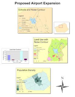
Note: The computer I used in SSCL wouldnt allow me to pull or manipulate data from my USB (I had this problem in class). This created a problem for the third exercise. I did all the steps correctly however it refused perform the calculations for POP_Den. It just gave me for all the values. That is why my bottom graph doesnt show any green area, and I couldnt include a legend as a result.

Potential and Pitfalls of ArcGIS

How broad the ArcGIS proved to be during my experience with it thus far has truly amazed me. The program’s ability to run calculations, generate graphs, incorporate aesthetic features, and perform spatial analysis all goes to show that it is very expansive. The program seemed like it took Microsoft Excel, Adobe Illustrator, Microsoft Word and mashed them up into a single map-oriented program. I thought each of the exercises would delve into finer details; however, this was not possible because ArcGIS has so many different applications to offer. Each of the 4 exercises served to merely scratch the surface of a different function that ArcGIS can perform.

However, the breadth of this program has its consequences. For a beginner like myself, the range of applications in this program creates a steep learning curve. The program still felt unfamiliar after going through the exercises multiple times. Furthermore, even though the tutorial easy to follow, it seemed like, as I said before, it only scratched the surface. The more advanced settings and features that the tutorial shied away from were very daunting to just look at. The program is not necessarily user-friendly in the way GoogleMaps is; however this pitfall is easily cured by experience and practice.

The dynamic performance of ArcGIS is another extremely helpful attribute of this program. ArcGIS is not a map. It has the ability to perform spatial analysis, recalculate and focus in on any details the mapmaker wishes. After finishing my map, I realized that I could boot the program back up, make a few slight adjustments, and present a map that had a completely different intended purpose. The way in which ArcGIS enables you to zoom in and out and recalculate information on different dataframes (the county boundary minimap) was tremendously useful.

I noted another setback during the fourth exercise. Even though the program offered tools to improve the look and feel of the map with colors and drop shadows, it still lacked some graphical splendor. This is of course irrelevant in an academic context because scholars are primarily concerned with the spatial analysis or accuracy of one’s work. However, eye-catching graphical displays are good in that they grab the attention of on-lookers. An informative map is not of much use if people don’t look at it. I have only worked with the program for a few hours so I am not certain that it lacks this feature, but it is one that I noticed.

A major setback of GIS is that it relies on inputs of data, which is either primary or secondary. It is advised to use more secondary data because it will save you time, effort and materials. However, this presents some problems. It could be the case that no secondary data exists on the topic of your research which forces you to directly capture your own data. Also, any secondary data that you do use could be inaccurate or outdated. In this sense, GIS can be either very dependent or time consuming and that is one of its pitfalls.

The potential of GIS has to do with its analysis. Humans often lack the capability to point out patterns when faced with an array of data. It usually require pleasant visual displays to point these patterns out. Sure it is possible to comprehend a number (ie the number of gallons of oil spilled in the ocean) but GIS allows viewers to better grasp the effects of the data your are dealing with.